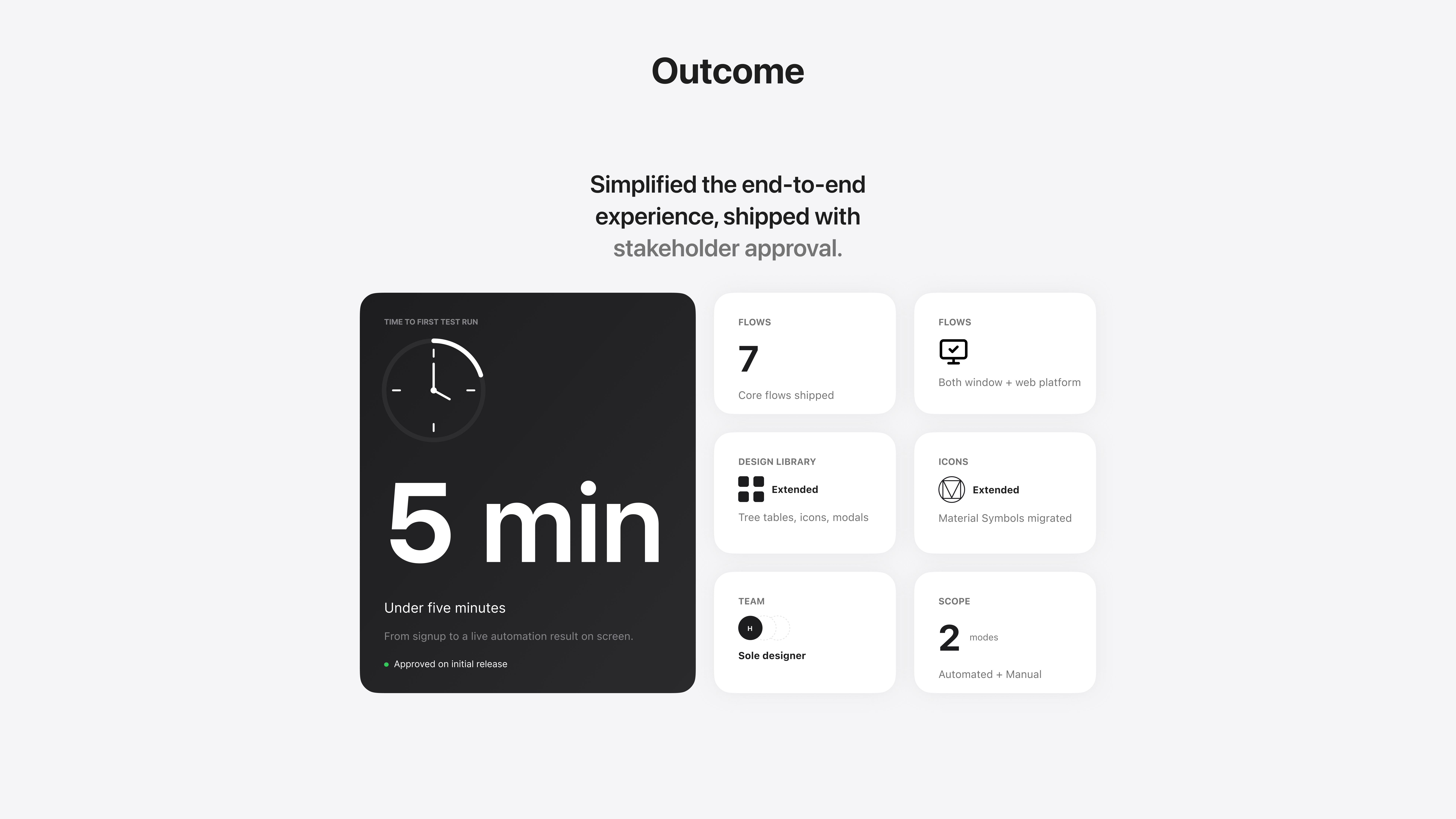
Simplified the end-to-end experience from onboarding to first test run in under 5 minutes, with stakeholder approval on the initial 3.0 release.
What's TestFirst?
What Needed To Change
TestFirst 2.0 was a web app and windows desktop application built around speed — testers could run manual tests, write exploratory test cases on the go, annotate screenshots, manage test plans, and link bugs directly to Jira, all without leaving the app. Real users praised it: faster test execution, time-saving test case management, and a UI that didn't overwhelm.
But the cracks showed up in the details. Actions like editing or deleting a test case required right-clicking rather than obvious on-screen controls — small friction that added up across hundreds of test runs. Reports were not customisable, limited to only basic built-in formats. Key features like Test Case Fragments were desktop-only, and so was execution history — nothing carried to the web. Users noted a learning curve that made early adoption slow, and the platform was entirely locked to Windows with no path to Mac, Linux, or browser access.
For teams scaling up, these weren't minor inconveniences — they were blockers. 3.0 was the answer.
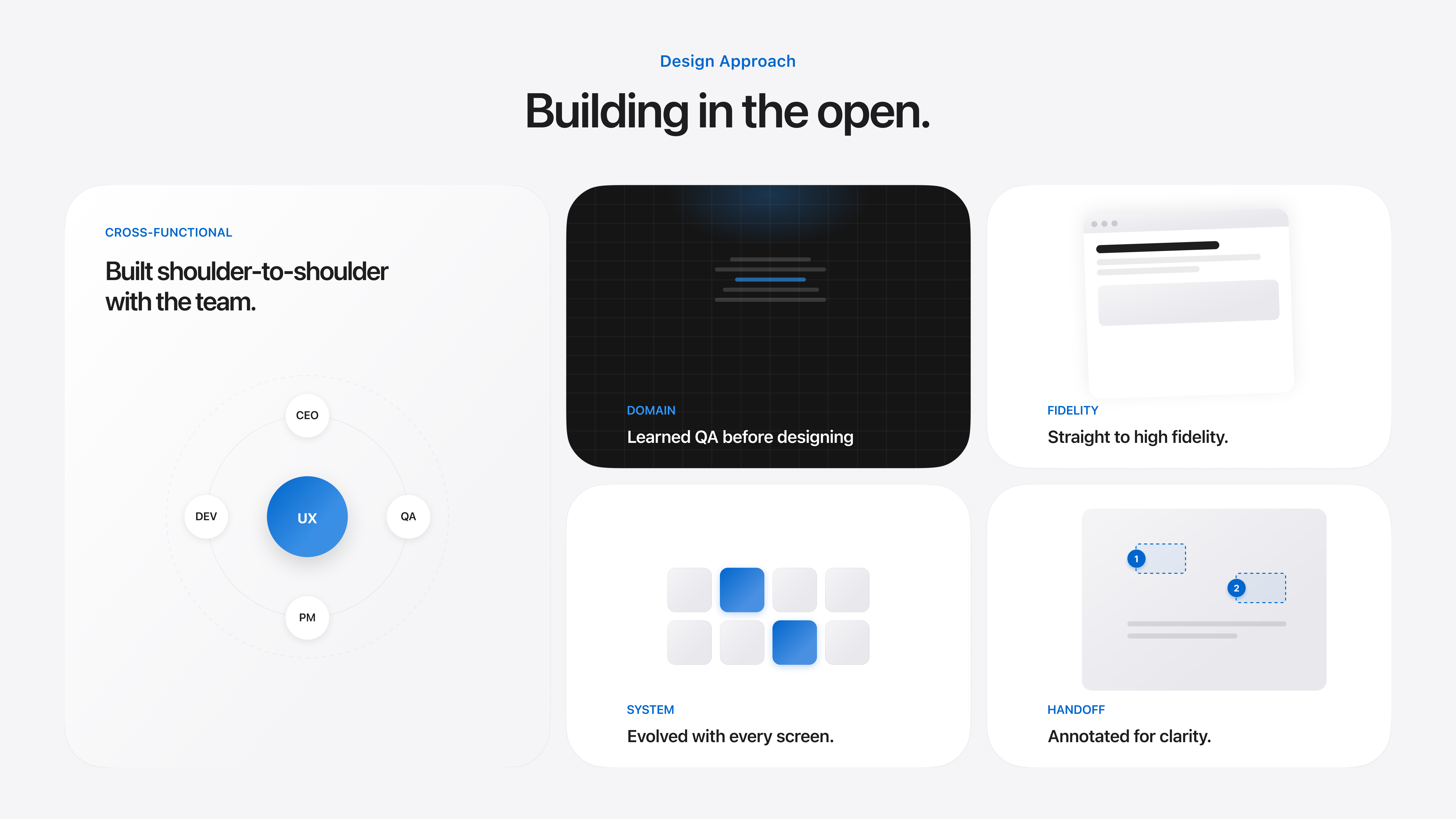
Scope and Direction
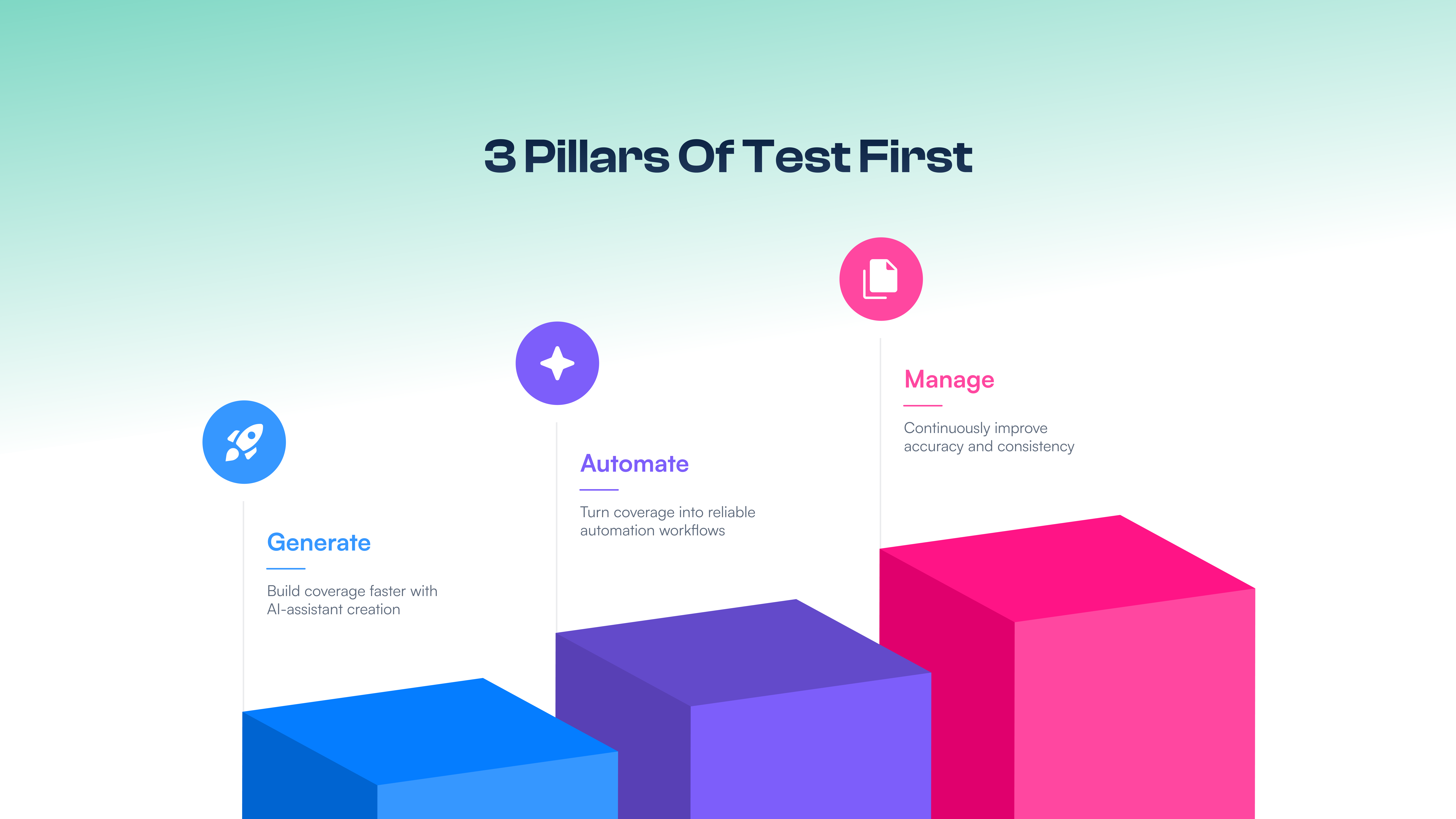
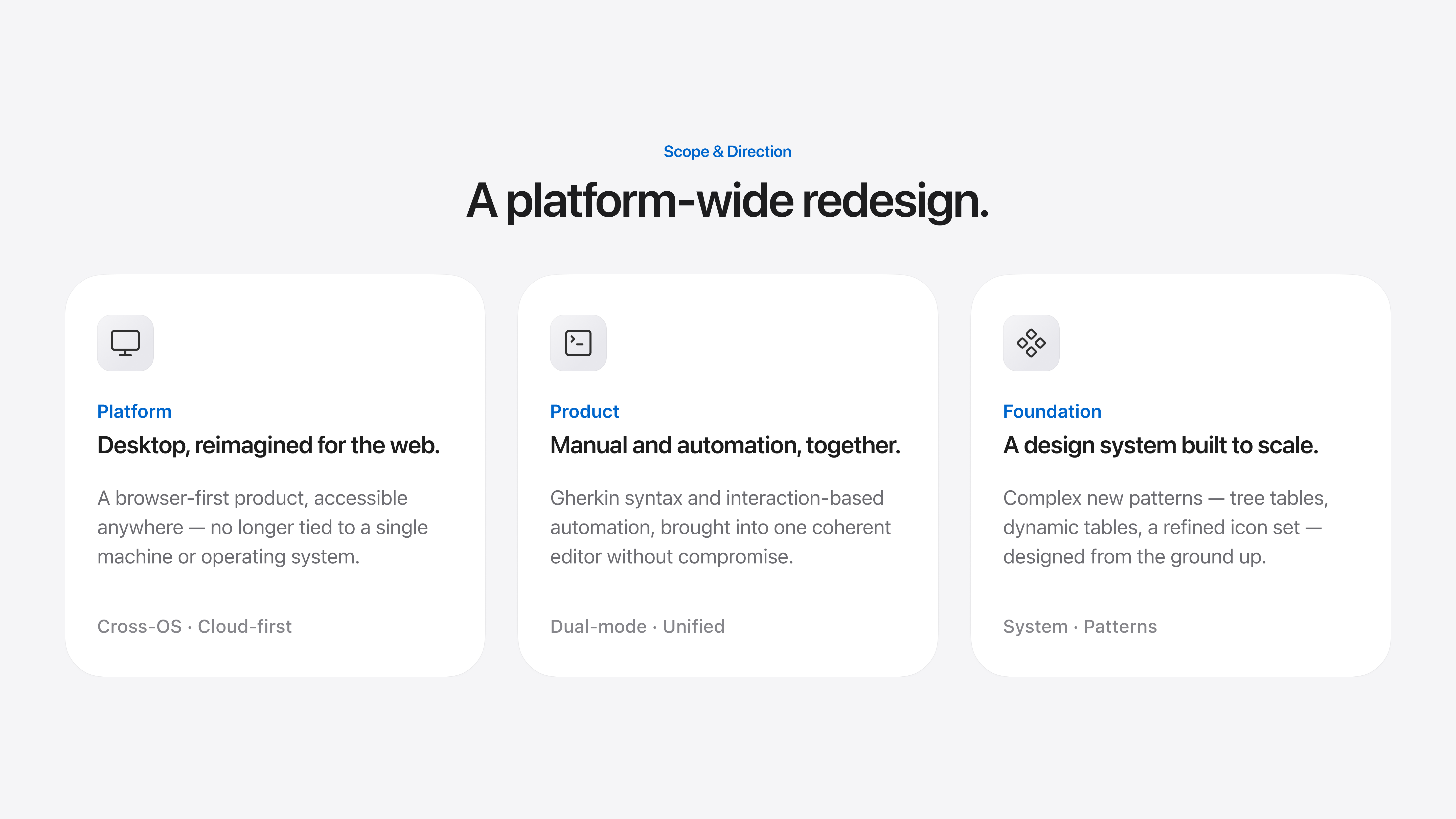
TestFirst 3.0 had a clear mandate: move the product from a Windows desktop application to a fully web-based platform, and introduce automation as a first-class feature alongside the existing manual testing workflow. The design scope was broad — seven core flows needed to be designed or significantly reworked, from onboarding new users all the way through to administration and settings.
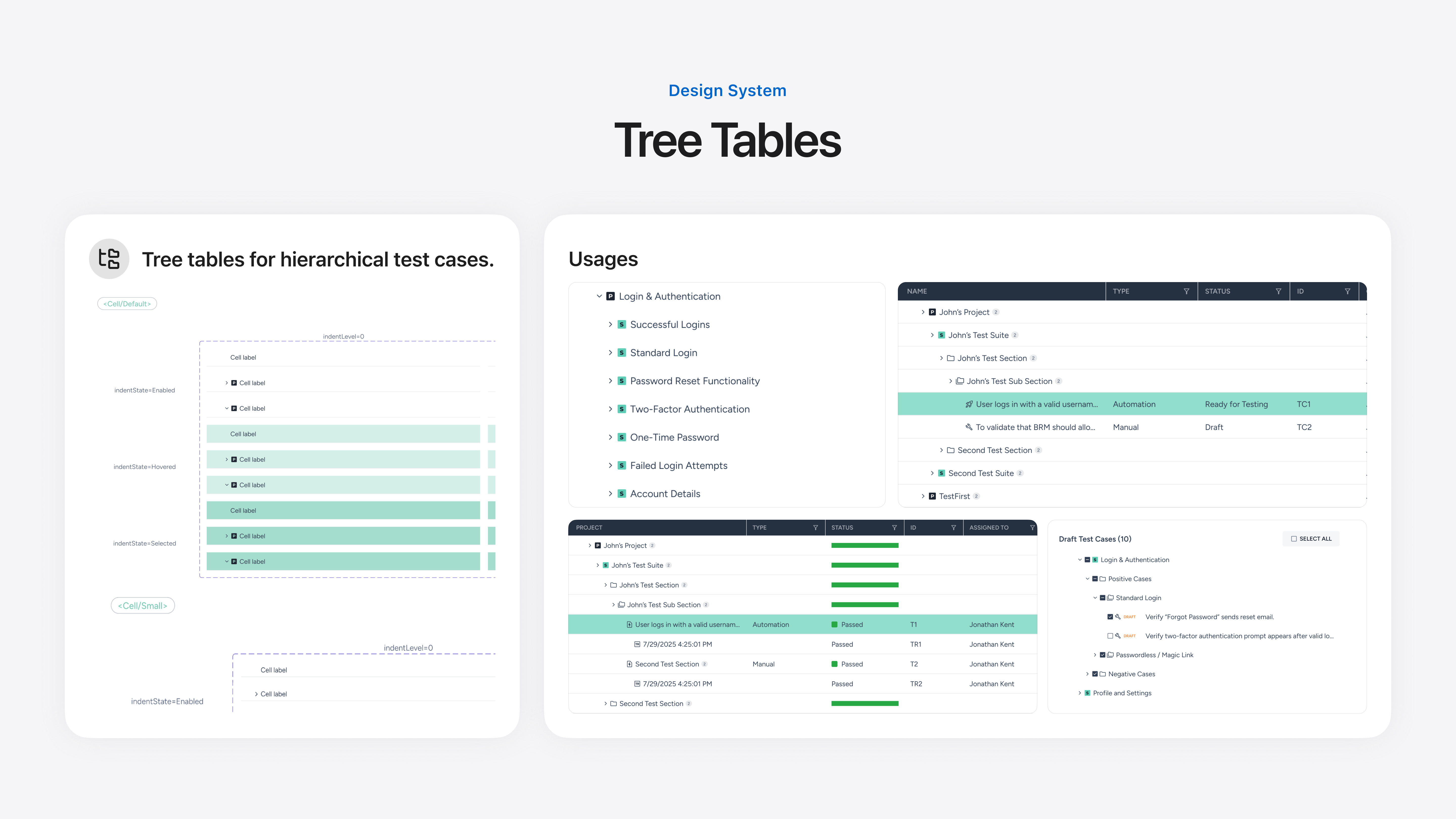
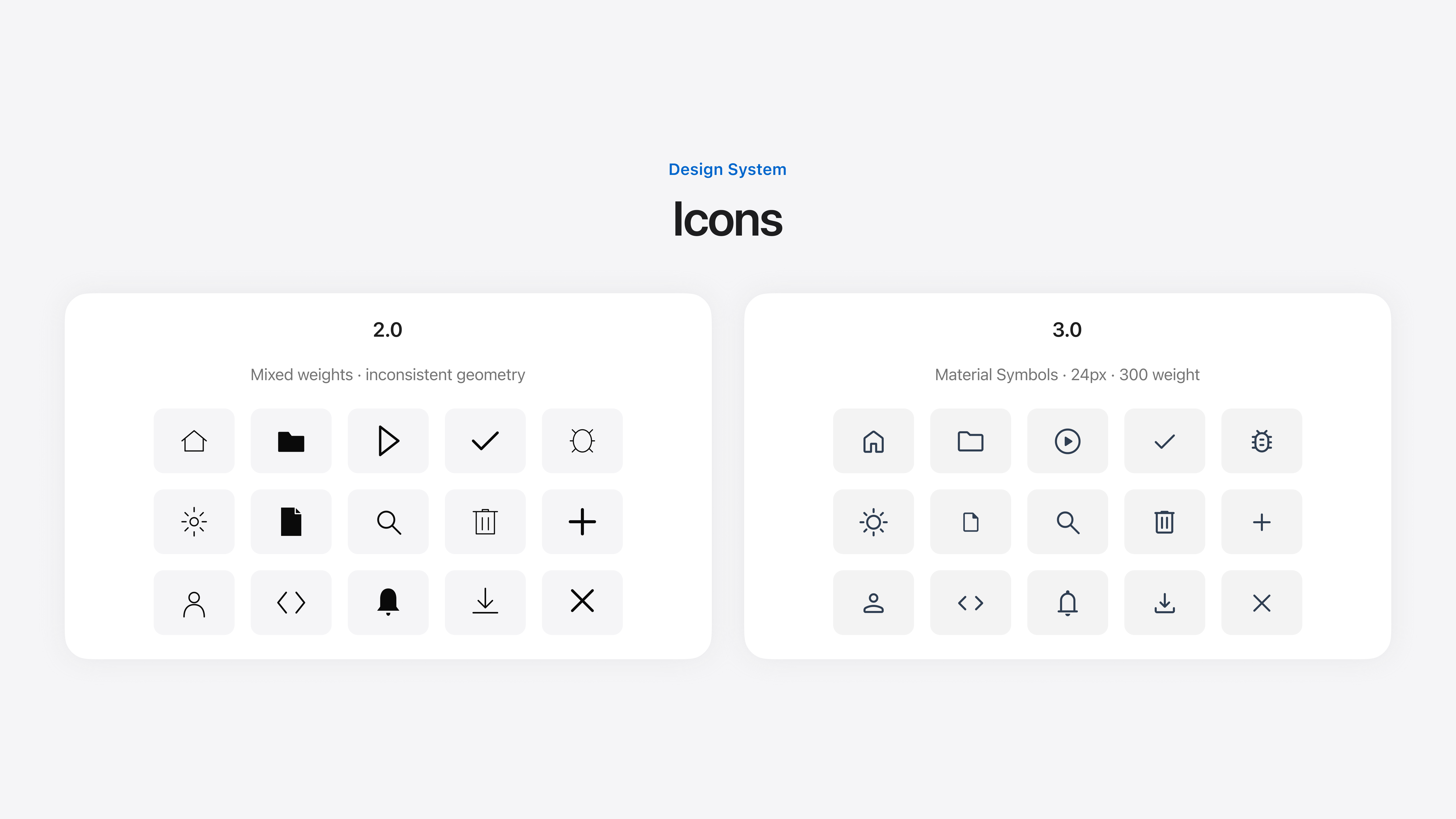
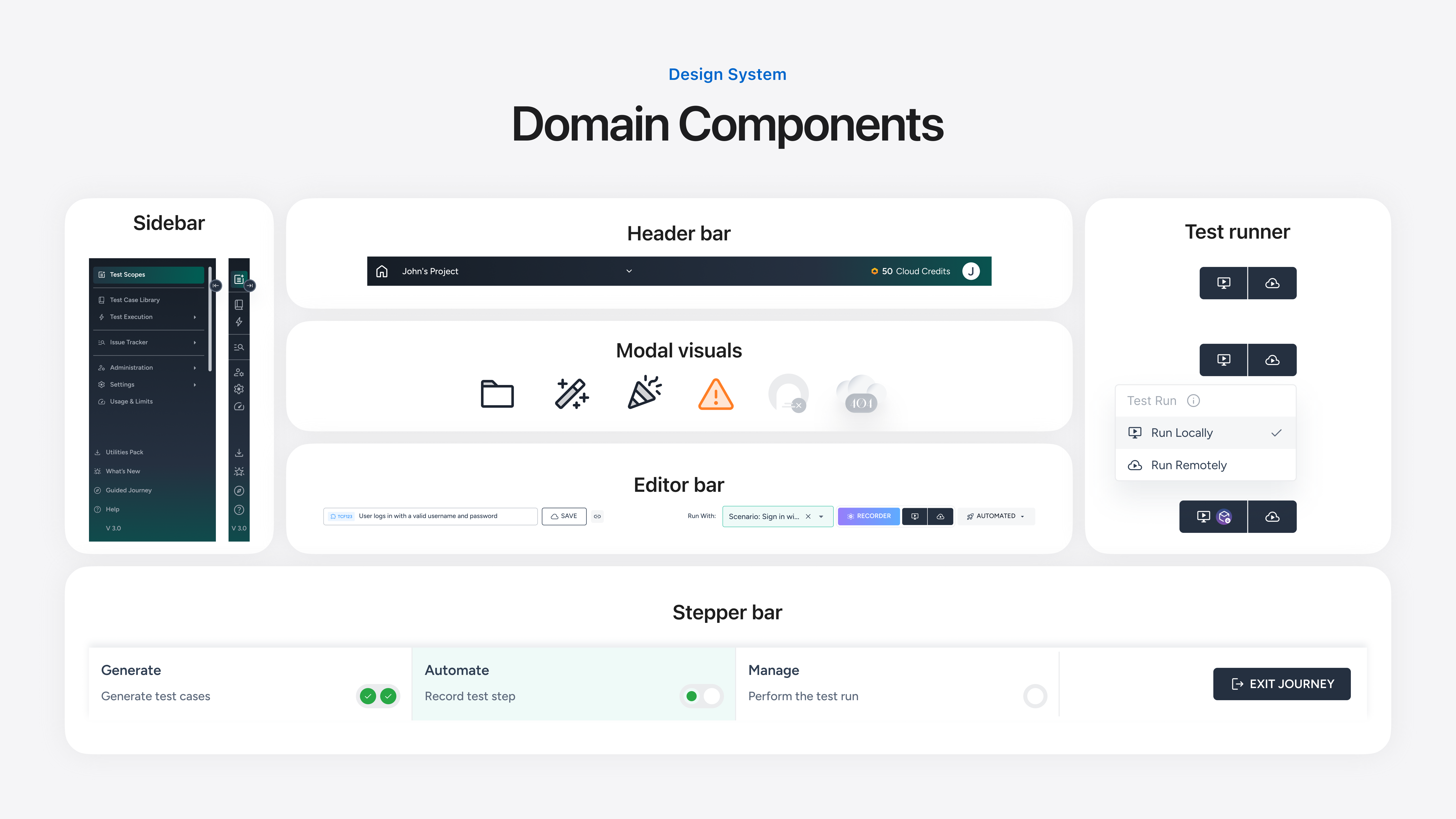
Alongside the product flows, the design system needed to be extended and refined to support the scale of 3.0. Components like tree tables and dynamic tables — complex patterns that didn't exist in 2.0 — had to be designed from the ground up. Icons were standardised by adopting and adapting from Material Symbols to create a consistent visual vocabulary across the entire platform.
The direction was clear: modern, scalable, and built for teams that needed both manual control and automation power in a single, cohesive interface.
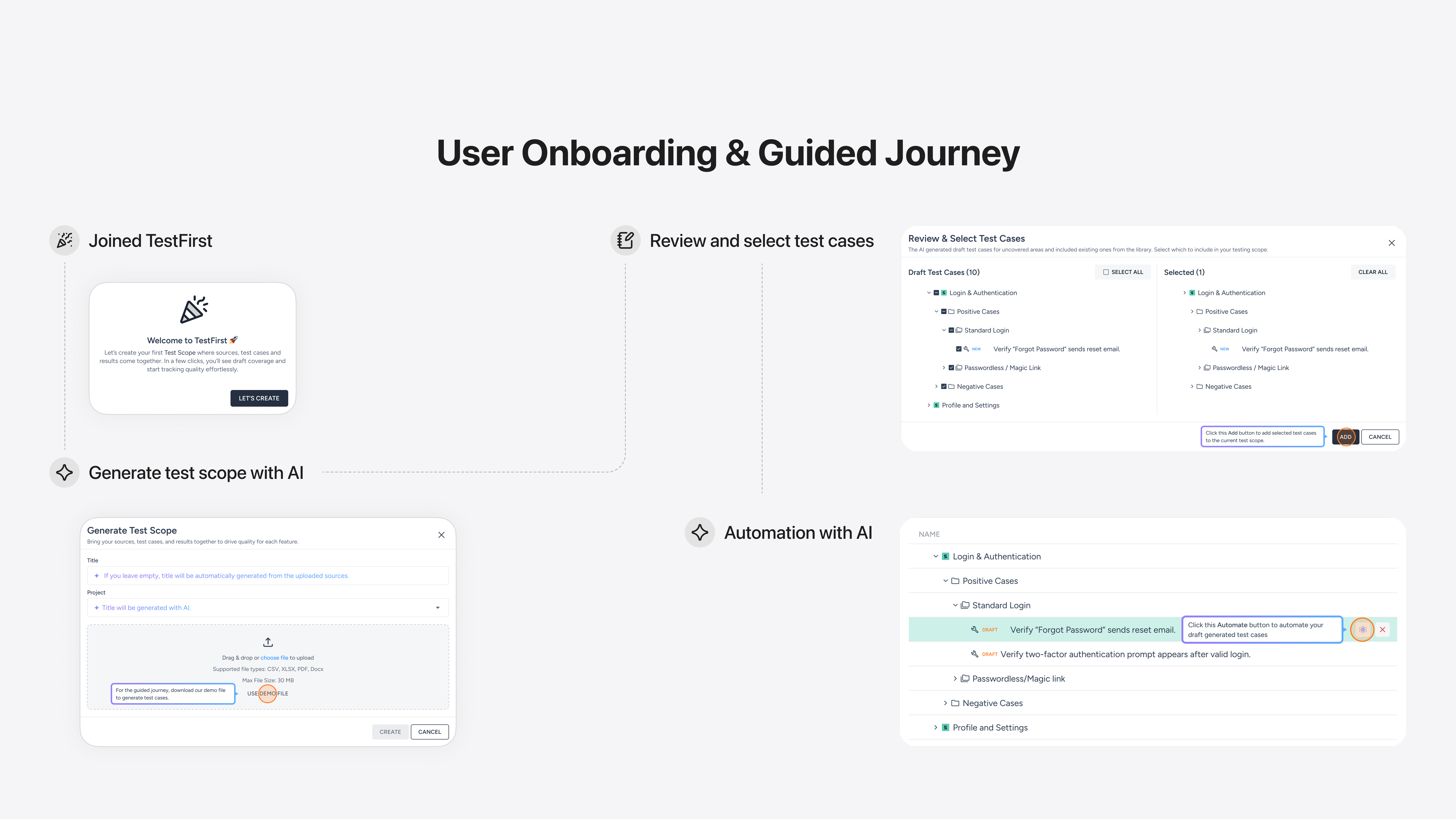
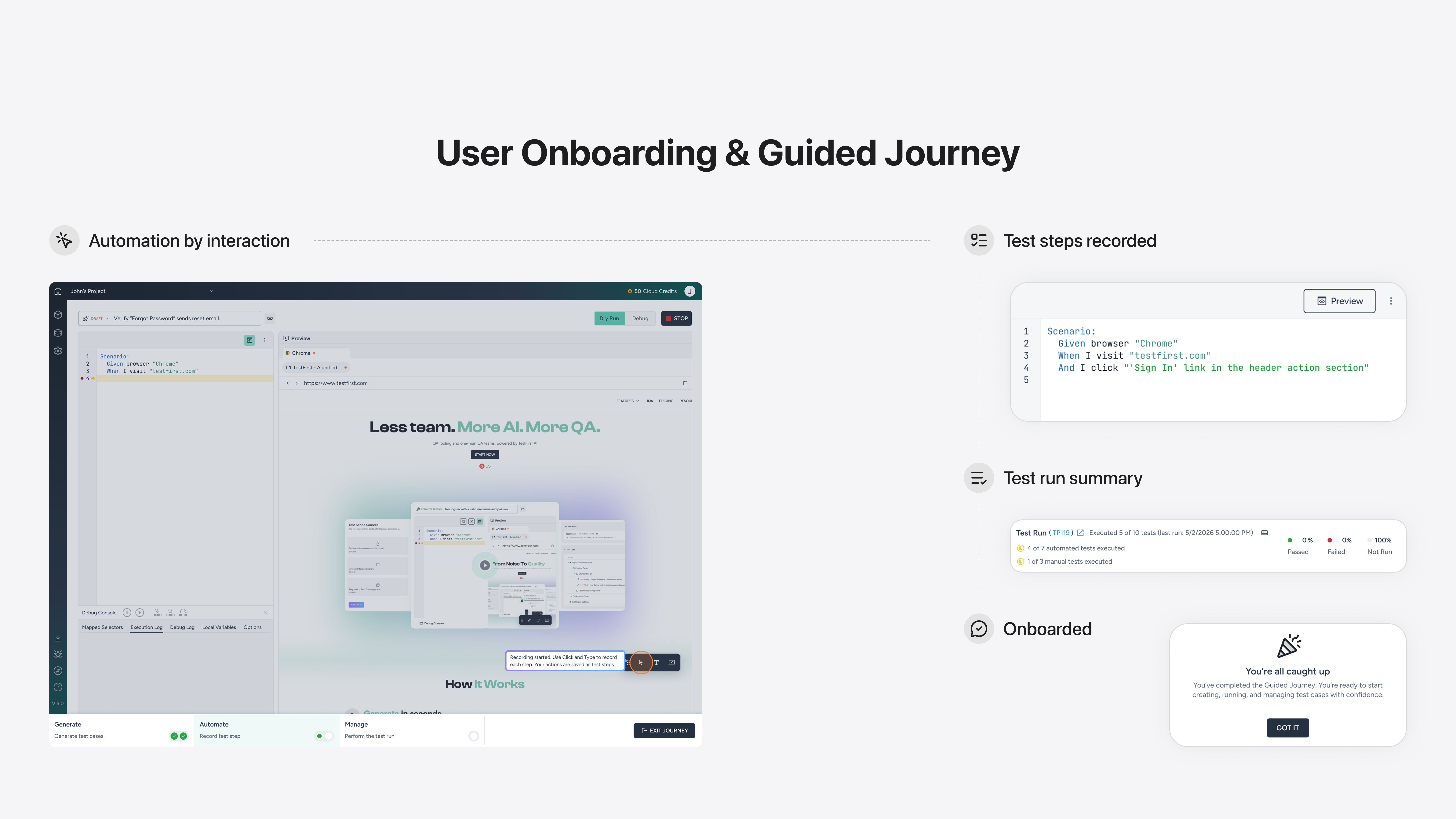
Onboarding & Guided Journey
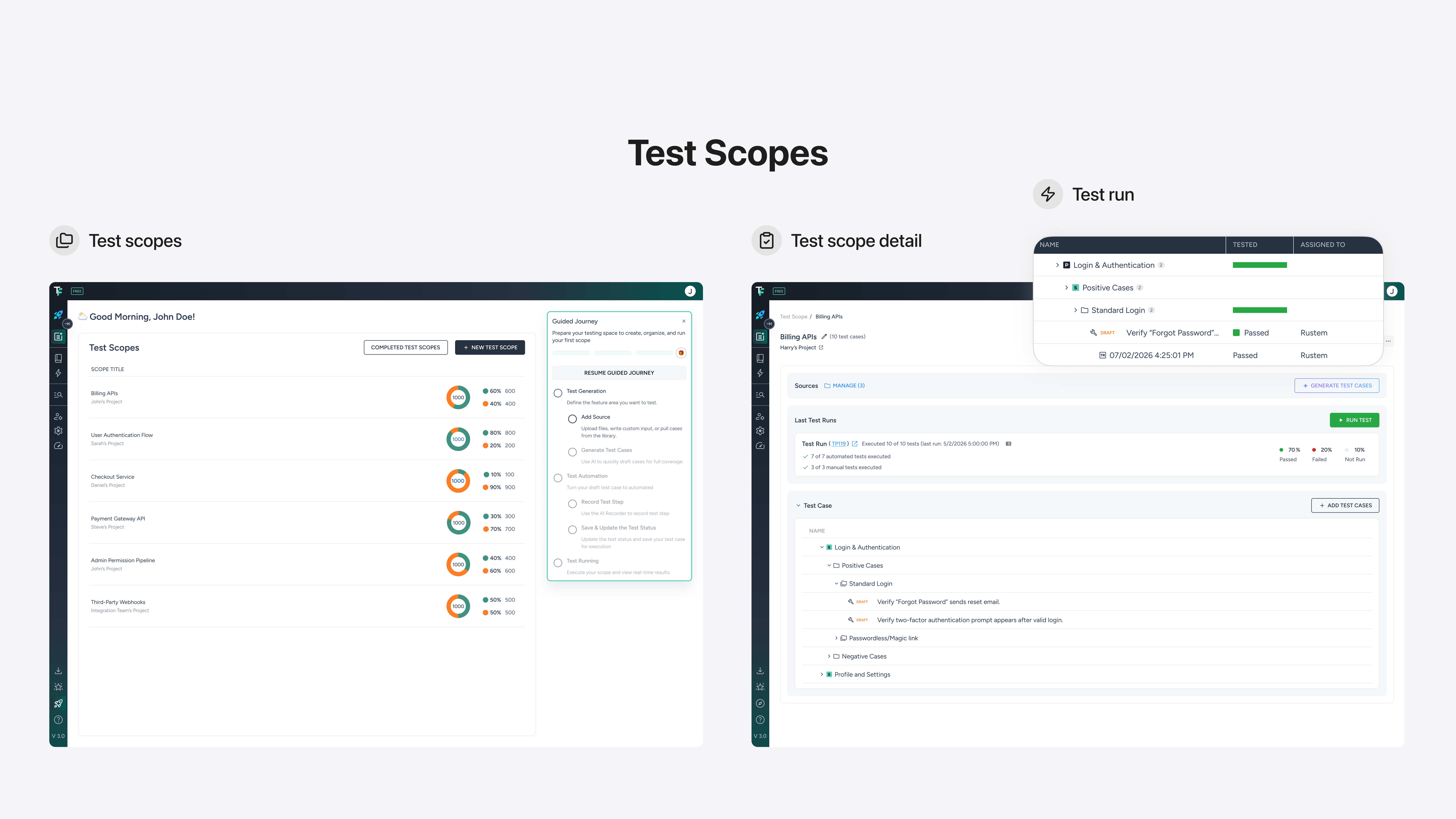
Test Scopes
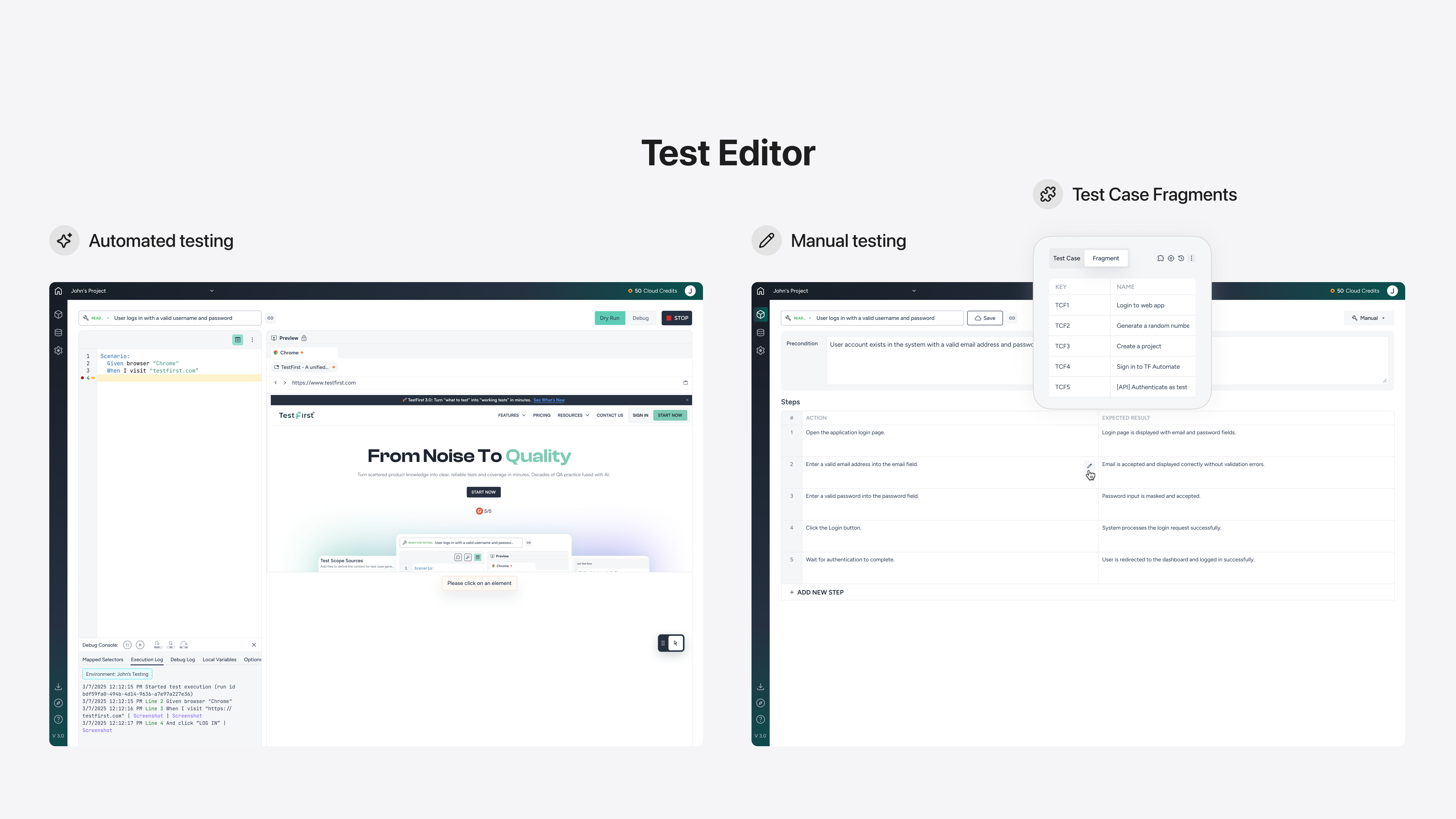
Test Editor
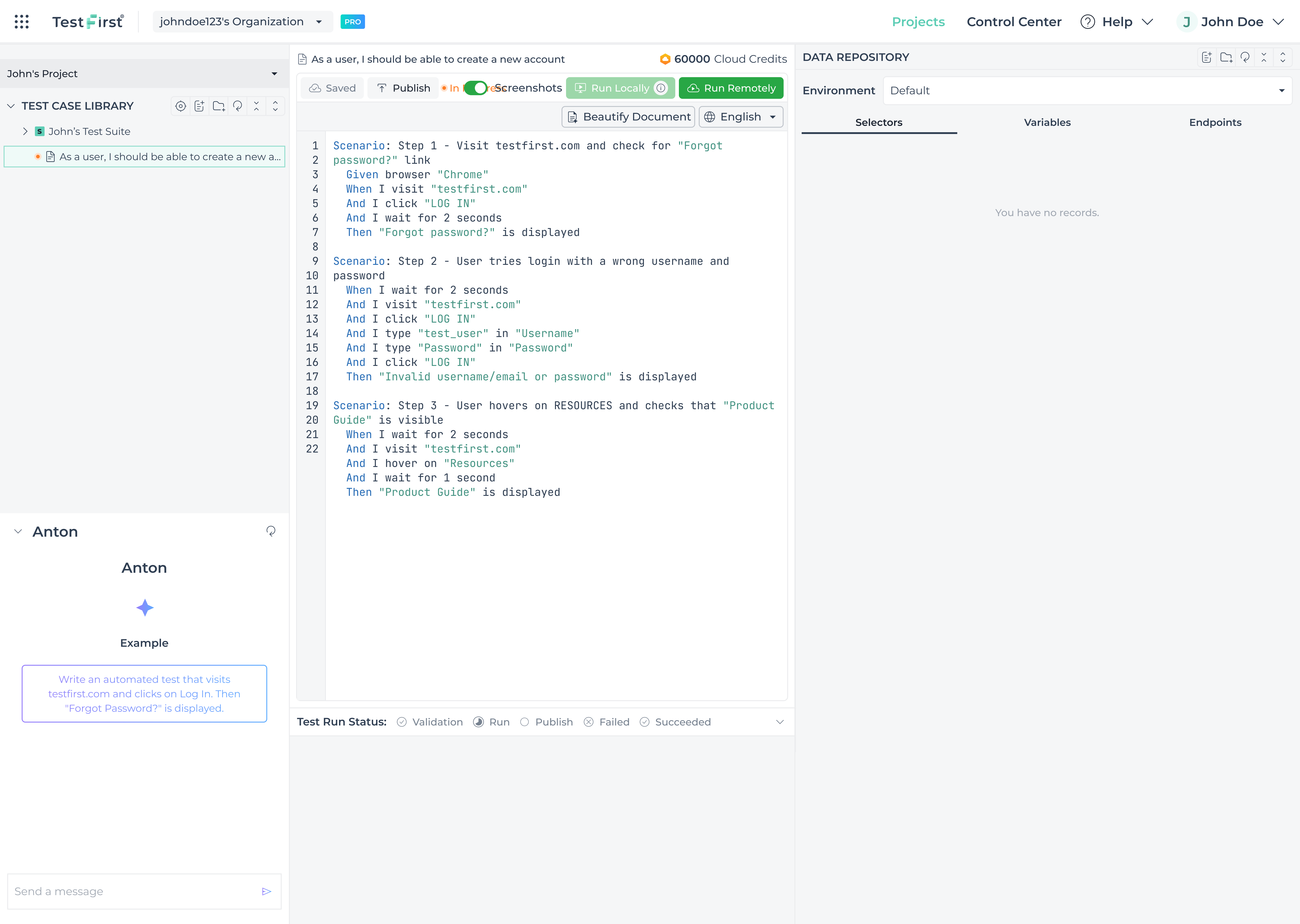
The TF Editor is where testing actually happens. In automation mode, testers write Gherkin syntax on the left while a live browser preview runs on the right — no switching tabs, no guessing. Debug mode surfaces mapped selectors, execution logs, and local variables in real time, giving teams full visibility into what the test is doing and why. Manual mode offers a clean structured alternative — a step-by-step table of actions and expected results for teams that prefer a non-code workflow. Reusable test case fragments and a tree-structured library keep everything organised as test suites scale.
Extending The System
Outcome
Reflection